Spell checker and my glasses would help ![]()
Thanks for showing raw.
I saw some silly argument about parallel lines effect but doesn’t make sense because the same applies to compensated plots. It is not unique to raw.
Keep raw going forward ![]()
1 Like
The sine illusion is actually a very real effect. It’s not nearly as impactful on compensated plots. I’ll find a link for this.
1 Like
Yes I’m not saying it is not real. I’m saying it will affect compensated plots too, so no point using that as an argument against raw plots.
If there is solid evidence that it is worse for raw than compensated, I am happy to read.
But the evidence needs to be solid - not fluffy and hand wavey
1 Like
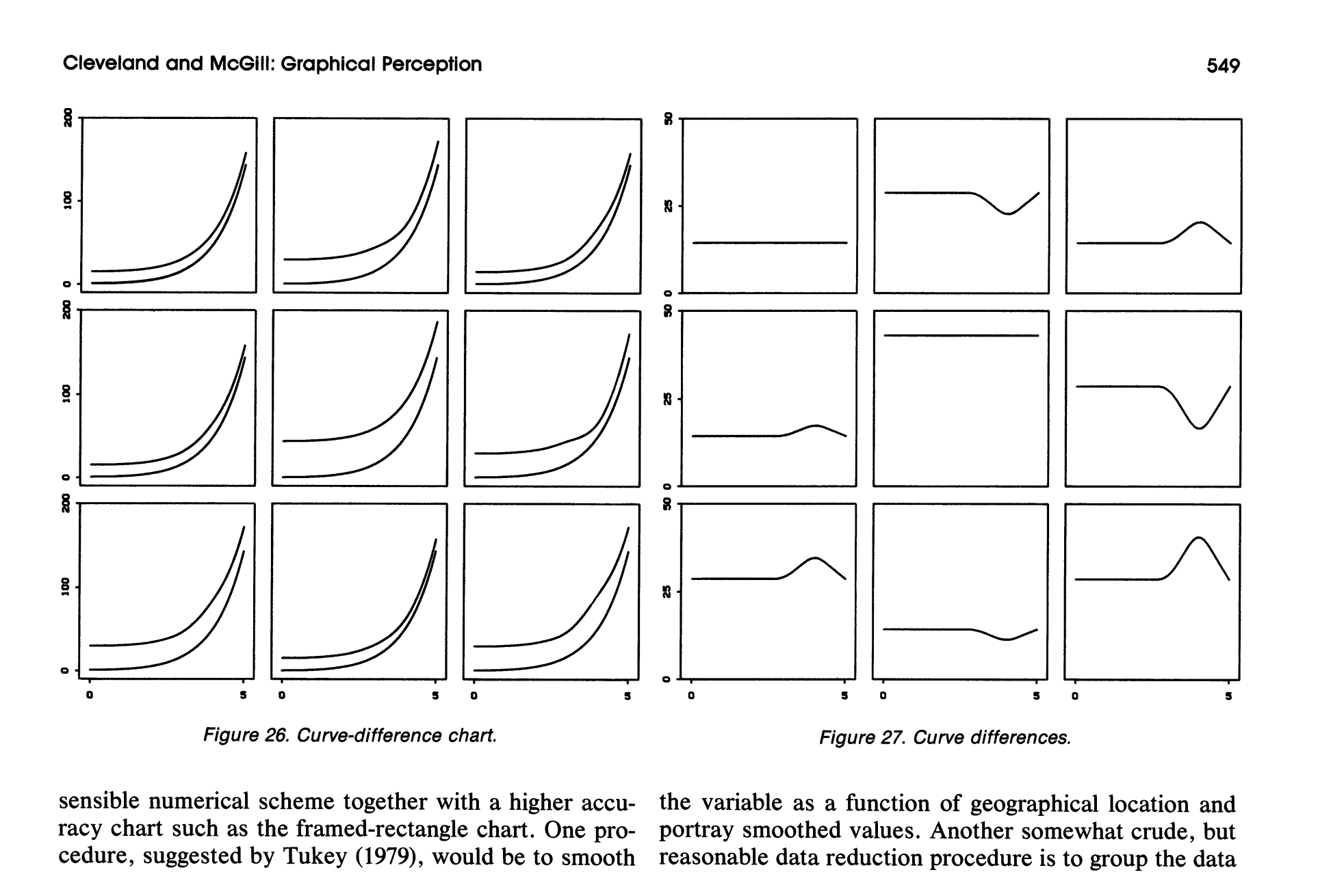
Sure. I found this image in particular to be a compelling case, since it shows exactly the problem when trying to identify delta between parallel lines, particularly when one isn’t held constant on the x axis.
Yes, visual illusions are present on compensated graphs as well, but the key point is that its far easier to be tricked by it in raws as the above chart shows. This is especially important when you consider that on raws you have to contend with the ear gain region, where a rise up to 3khz is expected. With compensated (or calibrated as it should be called), you don’t have that problem since its a constant plane along the x axis.
Here’s another example:
4 Likes
I absolutely love traditional graphs when communicating about speakers. However so far headphone graphs have always proved useless to me pertaining to headphones.
.
The 2023 Resolve Graphs showing listener preference shaded area, conveys a sense of potential for this headphone and ear pads. I seem to enjoy this and shall have to look to more 2023 Resolve Graphs.
2 Likes
It’s interesting, folks who are used to reading speaker measurements seem to much prefer this new approach to visualization, but those who’ve ‘grown up’ around headphone measurements are having a more difficult time.
To be clear, none of this is “the resolve target” or anything like that - I take zero credit for this, even though I support its use and uptake. This is all the brainchild of Mad_Economist. But I should also note that for those who may not be aware, this is also not a reviewer target of any kind like some may be used to from various different outlets. This is literally just the measurement rig’s DFHRTF being used as the calibration and the result is being shown against the Harman preference groups.
I’ve said this in other places but, the Harman research has been done dirty by target cults - meaning the lack of visualization tools and the overemphasis on singular targets has created a narrative inertia around the Harman target that’s not a fair representation of the research.
It’s to the point where as soon as you raise the topic you immediately alienate half the audience - who will by default always reject anything to do with Harman because they don’t understand the research. And as soon as you show something other than raw vs OE 2018, you get attacked by the other side, because they also don’t understand it.
This is our attempt at demystifying all of this and counteracting the common misuse of measurements.
3 Likes
Thank you for the clarification. I look forward to viewing more 2023 Mad-E Resolve Graphs and 2023 Mad-E Resolve Graphs Equalized.
MERG and MERGEd graphs for short.
2 Likes
Headphones.com is the leader these days with great videos, top of the line measurement equipment, assessible reviewers/@Resolve, covering just about everything-headphones, and a 1year policy for buying stuff! Keep up the good work and dont worry if you cant make everyone happy. Ill be funding this machine as long as the prices are competetive and your 1yr purchase policies live on!
6 Likes
An image of different lines really isn’t solid evidence. It doesn’t at all explain what we’re talking about here.
This doesn’t really explain anything that we’re talking about here.
That parallel lines illusion is worse with raw plots than compensated.
Seems hand wavey to me.
I understand the want to stand out by doing things differently, but seems to be overcomplicating things.
I don’t see the need to get caught up on saying people are doing it wrong by comparing raw plots on different rigs - just make a video about it and link it in the posts/videos and that’s enough.
1 Like

I mean, it’s literally visual evidence of the problem… What kind of evidence would you like? There are all kinds of citations there as well, would you like more?
Yes, that in the middle is the 10dB slope to show that the preference boundaries are just a more sophisticated version of that tilt.
It’s a picture yes. But how does that explain how raw is affected more than compensated… isn’t that the crux here? Wasn’t that one argument against raw previously ?
Are you just saying “look at the picture, you can see it is a problem” ?
You mean just the mention of Tukey (1979) , in your picture?
I have experience with data visualization, and don’t understand where this is going regarding the explanatory versus the “hand wavey” character of a chart or plot. All visualizations, 100% of them, are imagined and created to be comprehensible to humans and to match human visual capabilities. We have only the sensory systems we are born with, and must work around their quirks and limitations. Visualization is a cross-modal / cross-sensory method, and the best known way to grasp complex mathematical relationships. Still we must learn to interpret what our eyes see, be they simple pies, bars, dot plots, lines, etc. Similarly, we must label axes and set them on matching scales to avoid misleading ourselves (versus advertisers and politicians who use scaling tricks to lie/trick/persuade).
Sound is not vision, sound is sound. We don’t rely on “sound auditorization” for analysis because the linear and short-term human auditory system…absolutely sucks…for this purpose. Therefore, we translate transitory sound to static visual patterns despite the fact that sound is a time-dependent and fully unique signal. Per my history of working with research labs, even very weird looking speech plots can be remembered and ‘read’ as words with experience (not to mention read by AI).
Interpretation of a given music visualization follows this cycle: (1) Play music. (2) Look at a given chart for said music. (3) Play another sample. (4) Compare the charts for #3 to #2 (5) Repeat many times until the novel cross-modal meaning sinks in. Or until you confirm that it doesn’t work. If the chart is any good it may become a standard over time.
Regarding @Mad_Economist’s innovations in difference plotting, there’s a lot of work on this. Differences indeed are sometimes the best way to rescale raw data and focus on what matters. Per @Resolve’s “compelling case” above, raw plots can make little intuitive sense or be hard for our eyes to see – even if they too may be read effectively with experience and ultimately lead to the same analytical conclusions. Determining the interpretive value and clarity of a chart requires end user testing with fresh eyes, whereby suitability to task follows structured external human feedback.
Note that there’s a standard research method known as Difference in Difference, but this pertains to plotting diverging parallel lines over time and following treatment. I thought of this upon reading @Resolve’s comments above, and had to confirm my memory. If you seek to standardize on difference charts, please consider external terminology and the potential for confusion.
1 Like
Indeed it does - the rise into ear gain is very analogous to the curves used in the left figure (it’s from Cleveland & McGill 1984 - the entire cause of the sine illusion is horizontally close lines with vertical offsets (or vice versa), due to the human brain approximating distance between lines based on proximity rather than rigorously sticking to scale.
The effect occurs regularly when the ear gain of a headphone doesn’t perfectly match a target - e.g. here

However the illustration from Cleveland & McGill is a very concise demonstration - the real differences (right side cluster) are very similar to real differences we see in headphones (both level offsets and peaks/valleys), but the apparent differences seen in the raw plots on the left do not match.
If we did this, we’d be the first in history, which I guess could be something to put on our marketing ![]() historically, of course, the display of frequency response data has almost without exception been structured based on convenience (e.g. raw was common for a long while due to it being simply the output of an FFT, compensated became more dominant as computer processing to subtract the HRTF became cheap, then raw became dominant again when DIY and non-standard rigs became commonplace and there was no standard compensation). I’d like to see where we can go in terms of real testing of different visualizations - one experiment that comes to mind is having people EQ “by eye” based on a chart - but it bears remembering that there is nothing holy or indeed even founded in anything about where we’re starting.
historically, of course, the display of frequency response data has almost without exception been structured based on convenience (e.g. raw was common for a long while due to it being simply the output of an FFT, compensated became more dominant as computer processing to subtract the HRTF became cheap, then raw became dominant again when DIY and non-standard rigs became commonplace and there was no standard compensation). I’d like to see where we can go in terms of real testing of different visualizations - one experiment that comes to mind is having people EQ “by eye” based on a chart - but it bears remembering that there is nothing holy or indeed even founded in anything about where we’re starting.
I would not consider our approach here to be mirroring DID - DID implies trended data, and we don’t have trends in FR as such.
1 Like
And here’s where many tech explanations and analyses go sideways. Smart people (read: engineers) tend to ass-u-me what they produce makes sense. My work experience involves human research / user testing – a routine finding is that average people perform Stupid Human Tricks with whatever the smartest and bestest people can imagine and design. This applies to hardware, software, interfaces, widgets, packaging, etc. “Can 90% of users achieve 90% comprehension and complete 90% of the required tasks?” If you haven’t tested with an adequate sample of typical / fresh-eyed users, the odds are no. Not at all.
The audio industry might indeed become more rigorous about human testing, but then what would the magic crystals and cable sellers do to earn a living? Won’t someone think of the children??? ![]()
Data visualization underwent an explosion in quality and variety with the growth of computer graphics and high-speed processing. Static old-school academic-like plots often still work fine, but there’s much more that might be done with 3D stuff. Before going that deep, I’d perhaps set up an interactive system that shows your newfangled plots (above) and allows users to change EQ settings and see the visual impact as music plays. Simple – and likely self-training on the meaning.
While end-user testing typically ensures real-world comprehension, engineers, domain experts, and interested parties often reach a meeting of the minds through discussion. Outsiders routinely ass-u-me and don’t know the pitfalls or even where to look for pitfalls (I flash back to cheap, yucky 1980s department store stereo speakers that had little frequency graphs on the front panel).
Nope. Not at all. But in showing differences and diversions from parallel boundaries I did a double take.
2 Likes
@Resolve - Would you clarify how the preferance boundaries were calculated/determined? If the upper boundary was calculated/determined different than the lower boundary, would you clarify that too? If you’re not sure, do you have a link to the study that gives the details?
Just want to understand the statistical relationship between the preferance boundaries shown on the new style graphs vs the average preferance identified/calculated from the harman research or wherever the preferance boundaries were born from.